

 blog.kissmetrics.com/12-infographic-tips/
1. Create your infographic for your target audience.
The infographics with the most traction, most attention, and most virality, are ones that meet your target audience right where they want it most.
One mistake that I’ve seen people make when creating an infographic is that they try to choose something that is generically popular rather than specifically relevant to their audience.
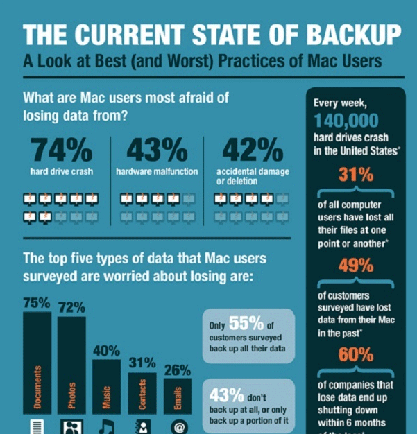
This infographic has a target audience — public school teachers.

Your goal is to create an infographic for your audience, not necessarily for the whole world. Keep it specific, relevant, and targeted.
2. Keep it simple.
Like everything else in life, infographics are better when they are simple.
This infographic would work better as four or five infographics.

Simplicity wins. Always.
3. Keep it focused.
Simplicity, discussed above, is ultimately about focus. Don’t just make your infographic a potpourri of facts and figures. Make it a streamlined and focused on a single topic.
Infographics are not attempts to randomly assemble all the data you can compile. Instead, an infographic is intended to drive a single, focused point.
This infographic is focused on a single topic — backup practices of Mac users.
4. Show things visually.
I’ve seen infographics that are short on the “graphic” and long on the “info.” The best infographics are ones that have a good balance of visual information with written information.
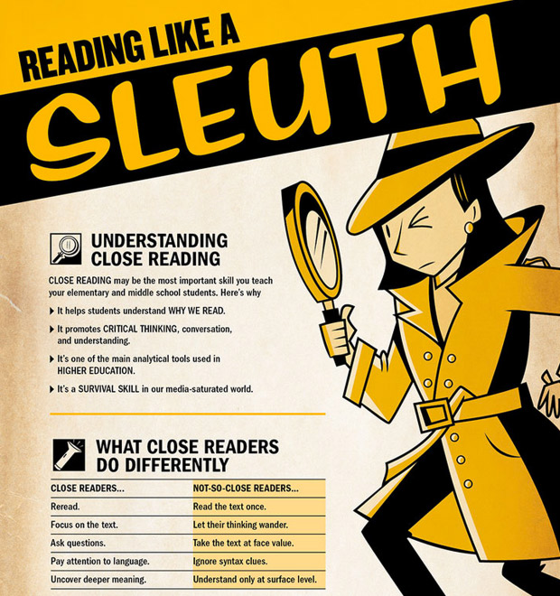
This infographic uses a few icons and an image, but not a whole lot of other visual elements. To qualify for the “graphic” in infographic, it needs some more visual pizzazz.
5. Make it easy to view.
Many infographics have a variety of font sizes. Make sure that the smallest font on your infographic can be seen without too much difficulty.
The words in the infographic below have become too small to read easily.
The infographic should be easy to read and view, whether the user clicks to enlarge or not. 600 pixels wide is a good width to aim for.
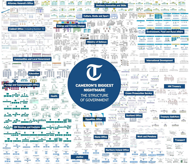
6. Make it a manageable length and size.
Infographics are supposed to be big. We get that. But go too big, and you’ll start losing people
I recommend a limit length of 8,000 pixels. Anything longer, and you’ll start to presume upon your user’s attention span.
This infographic, at 24,575 pixels, is probably approaching too long.
Image from KillerInfographics.com.
7. Add white space.
Any graphic designer will tell you that white space is important.
There’s not enough white space in this infographic (which might be its point).
Good infographic design includes a balance of visual elements with the necessary negative space to help guide the viewers as they look at the infographic.
8. Create a killer headline.
The infographic doesn’t get any attention if it doesn’t have a great headline.
Good headlines will have these features:
- They describe the infographic
- They grab the user’s attention.
- They are short enough to understand at a glance. 70 characters is a good length.
If you don’t have a powerful headline, your infographic simply won’t get viewed. That’s all there is to it.
This infographic, for example, has a wordy title that might not get the level of attention it wants.

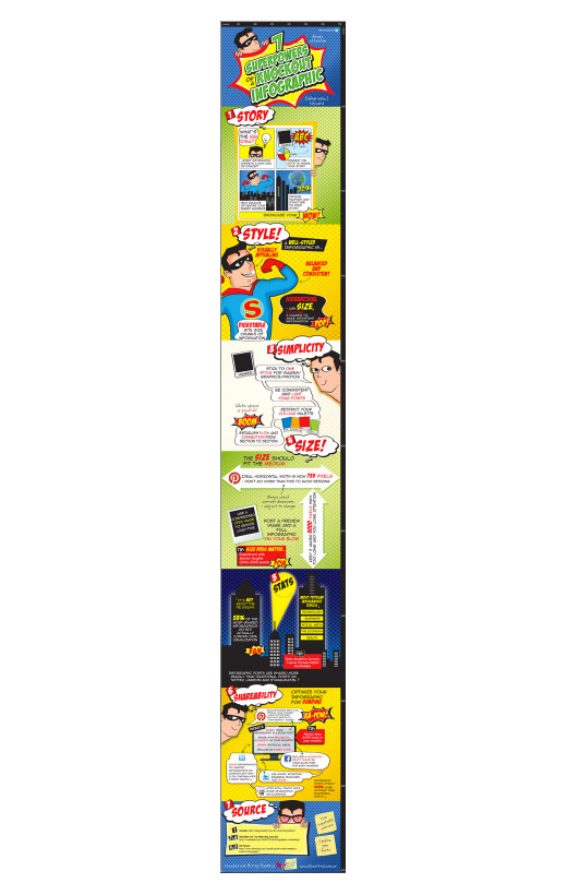
9. Focus on the flow.
The greatest strength of an infographic is that it can flow both cognitively and visually.
An infographic is like a good story. It has the ability to convey an idea by taking you from one phase to another, sequentially and seamlessly. The dots are all connected, and the ideas integrated.
Even when this infographic is viewed from far away, it has obvious flow. Each section has a number, a headline, and a different color background. It’s comic book style helps us to better read each section. Every one of the visual elements serve to create a more powerful flow.
10. Check your facts and figures.
Many infographics focus on presenting data. It’s a smart idea. Our minds can process stats and percentages way better when wesee them, rather than just look at a number with decimal points and percentage signs.
But make sure that you’re being accurate, by focusing on these three oft-overlooked areas:
- Make sure that the statistics themselves are true.
- Make sure that your sources are reliable.
- Make sure that your graphical representation of the data lines up with the number (if you have both)
11. Cite your sources.
Just because you’re making an infographic doesn’t mean that you’re released from needing to cite your sources. Where did you get your data? Cite it.
I usually cite the source of my infographic data at the very end of the infographic.